Project information
- Category: Graphic Design-UI/UX Design
- Project date: Forth Semester
- Software: InDesign
Creating a Journey Map for Improving a Money Management App
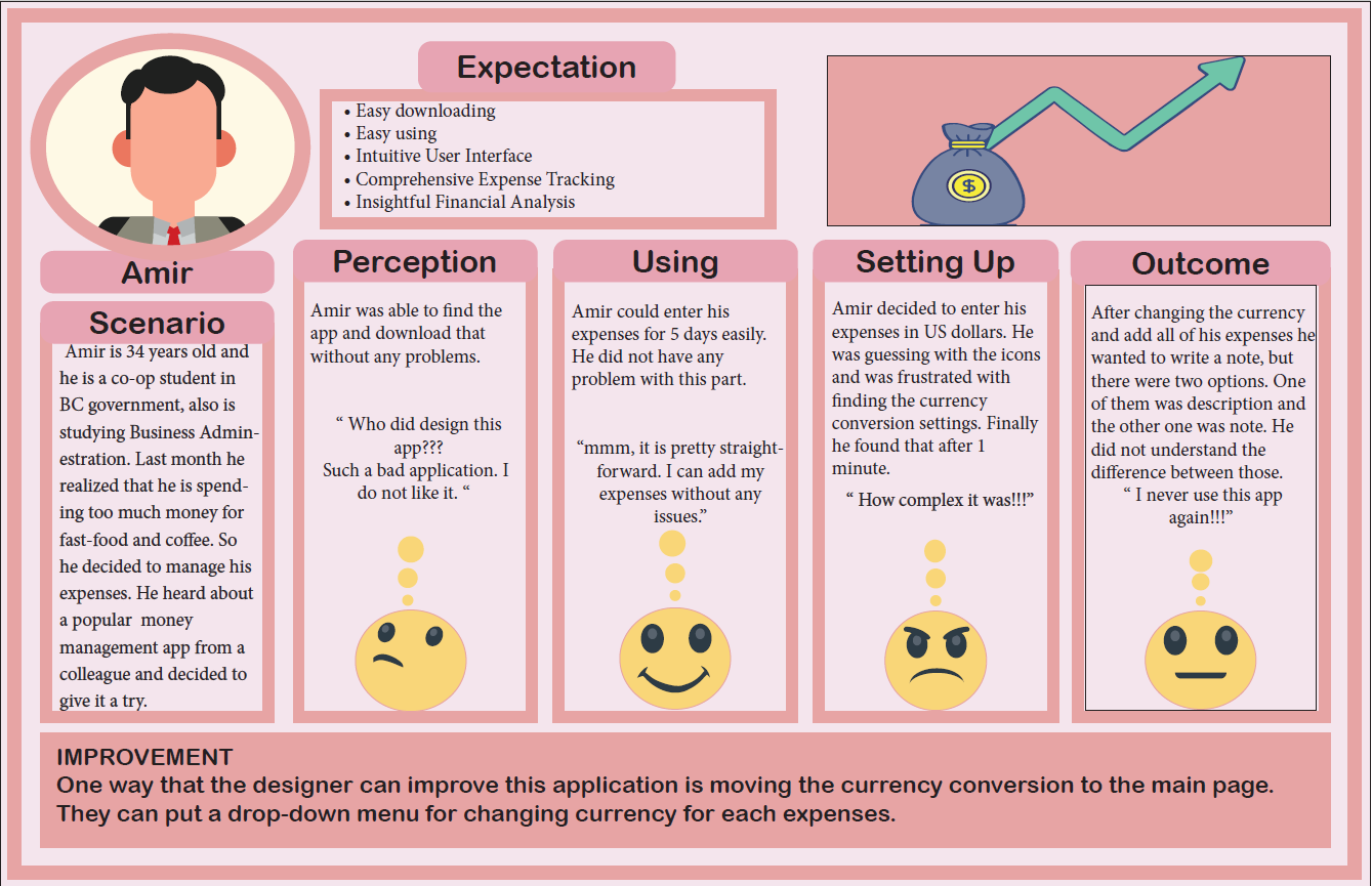
In this project, I developed a journey map to analyze the user experience of a popular money management application. The map centers around Amir, a 34-year-old co-op student studying Business Administration while working in the BC government. Amir decided to try the app after realizing that he needed better control over his spending habits, particularly on fast food and coffee.
The journey map tracks Amir’s experience from the moment he downloads the app to his eventual frustration with its complex interface:
Amir had no trouble finding and downloading the app, which initially gave him a positive impression. However, his perception quickly shifted when he found the app's design to be unattractive and difficult to navigate. Despite his initial misgivings, Amir managed to use the app for five days without any issues, successfully entering his expenses.
The turning point came when Amir attempted to change the currency setting to US dollars for his expenses. He found the process confusing and unnecessarily complicated, leading to frustration. This experience worsened when he tried to add notes to his expenses. The app provided two options, "description" and "note," which Amir found redundant and unclear. This confusion ultimately led him to decide never to use the app again.
Through this journey map, I identified several key areas where the user experience could be improved. The most significant improvement suggestion was to simplify the currency conversion process by moving it to the main page and providing a drop-down menu for easy access. This change would make the app more intuitive and reduce user frustration.
This journey map was crucial in identifying the pain points and challenges that users like Amir face, guiding the redesign process to create a more user-friendly and efficient money management application.